Displaying Collections of Data in Xamarin Forms - A Practical Guide
Nate Falkoff | July 14th, 2021

One of the most common tasks in any application is to display lists of data. The Xamarin Forms documentation offers a few ways to do this: the ListView, the CollectionView, and the lesser known Bindable Layout.
As a new Xamarin developer creating page after page of data displays, I found it confusing to know which view to use at what time. Initially, I found myself making lots of ListViews and struggling to achieve what I wanted, so I moved to CollectionViews only to run into the same problem. It took months before I realized that a third option, the Bindable Layout, even existed. Although the ListView and CollectionView offer more ‘out of the box’ functionality, they come with certain features that are difficult to disable and other hidden side effects.
My objective in this article is to help distinguish when to use these different views, point out some caveats and helpful tips I’ve learned the hard way, and highlight the Bindable Layout as a lesser-known option.
Differences in ListView and CollectionView
The ListView and CollectionView are the built-in views for quickly displaying lists of data in Xamarin. They both work in similar ways. By binding a collection of data to an ItemSource property, you can then display each item in a collection in a customizable ItemTemplate.
One key feature is that both views have built in properties for easily enabling or disabling Selection.

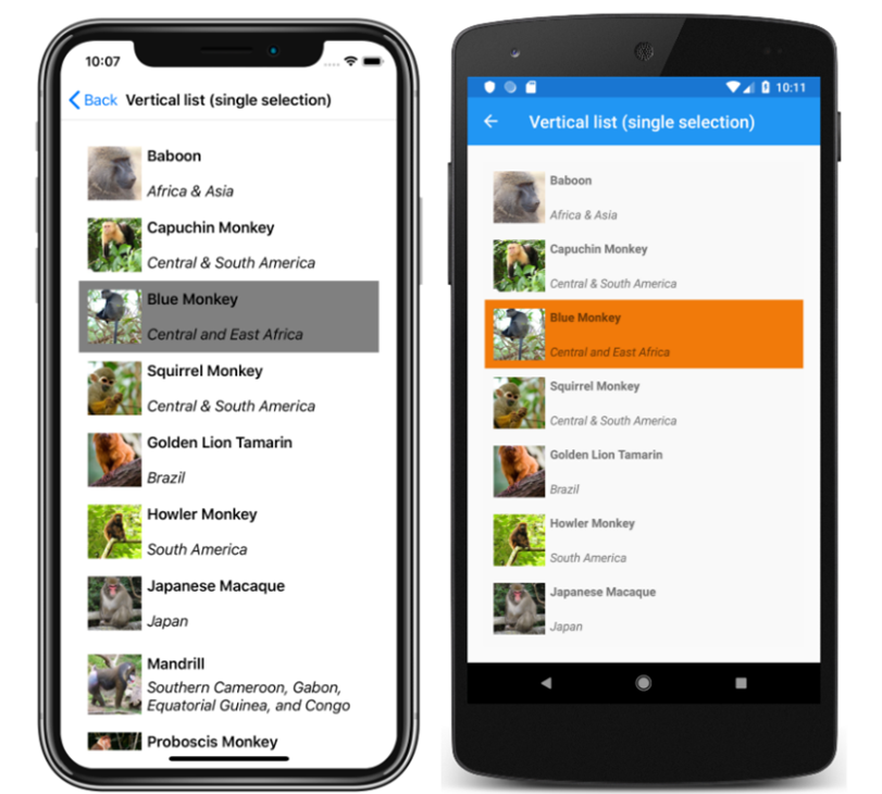
In this example, Blue Monkey is the selected item. You can easily track, modify, and trigger OnSelection commands, to navigate to a detail view when selected.
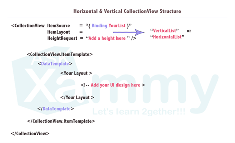
The code for the CollectionView and ListView are very similar, and look something like this:

So how are these two views different?
- The CollectionView is the successor to the ListView, and was essentially made to be a more performant, flexible version.
- CollectionView adds the ability to display horizontal lists, grid lists, and multi-selection. ListView only supports vertical lists and single selection. It also comes with default dividers between rows (which can be disabled).
- CollectionView has a different, reduced API than ListView. ListView contains the concept of “ViewCells”, which are basically preset layout options.
- CollectionView adds a very useful EmptyView property, which allows you to define a UI view or simple string that displays when the collection is empty.
From my experience, I have found anything I can do in ListView, I can do in CollectionView, but vice versa is not true.
Why you might want to avoid CollectionView and ListView altogether
- Forced scrolling behavior. Both views come with built in, non-customizable, mandatory scrolling. This means if the content of the page extends beyond the device’s size, the view will become scrollable. Usually, this is desirable. But consider if you have a list of 10 monkeys, and a separate list of 10 elephants, and you want to display both on the same page. The scrolling for each list becomes independent of the higher-level page. Displaying multiple lists of data on one page results in a scrollable page with two (or more) independent scrollable data tables nested inside. This is very clunky on a mobile device. One scrollable area that contains all data is much more desirable.
- Can be hard or confusing to override UI properties. If we look at the monkey example, the default selected item color is Gray in iOS and Orange on Android. The code to change this color is fifteen lines of xaml, rather than a simple property. If you would like to use selection but remove the color altogether, you have to set the selection color to transparent. However, it will still display a gray selection animation OnTap, which may look odd depending on your UI. I use this as just one example to show that disabling and customizing the built-in behaviors and animations of these views can be a headache.
- CollectionView and ListView are notoriously unpredictable when adding complexity to your UI. If you don’t believe me, take a brief moment to peruse some of the 359 (as of this writing) open issues with CollectionView here. ListView clocks in at a more modest 266 open issues. There are usually fairly easy workarounds to whatever bugs you might encounter, but buyer beware.
One helpful tip for properly using a CollectionView or ListView is to put any additional content on the page in a Header and Footer. This will allow the additional page content to scroll along with the data.
DIY data lists with Bindable Layouts
How can we avoid wrestling with these built-in behaviors? The Xamarin Forms Documentation says “A bindable layout can be used when the data to be displayed doesn't require scrolling or selection.” It is in fact quite easy to add both of these features to any bindable layout. Using bindable layouts, any StackLayout or Grid becomes a flexible, customizable way to display data. A bindable layout uses a very similar syntax to CollectionView and ListView, defining an ItemSource and ItemTemplate.
<StackLayout BindableLayout.ItemsSource="{Binding Items}" />
From there, you can add any customizations you like without the unnecessary defaults of a CollectionView or ListView. For scrolling, you simply nest the bindable layout, or your entire page, in a ScrollView. For Selection and commands, you can add a TapGesture Recognizer. I’ve found it is generally much easier to figure out how to add something to a bindable layout than take something away from a CollectionView.
Keep in mind that under the hood, CollectionViews and ListViews are both just fancy bindable layouts. Anything you can do in those views, you can do yourself in a bindable layout as well.
Summary
- CollectionView is essentially a more flexible, improved version of ListView. Both provide quick out of the box ways to display collections of data. If you aren’t overly specific in your UI needs, this is the quickest and easiest way to display data.
- Both CollectionView and ListView contain certain features that are hard to modify or disable, and both become increasingly prone to bugs and unexpected behaviors the more complex your UI becomes.
- If you find yourself wrestling too much with CollectionView and ListView’s default behaviors, it is surprisingly easy and often preferable to create custom Bindable Layouts.
Citation:
Reyes, Leomaris. “Make Your Life Simpler with the CollectionView's Layouts.” AskXammy. Horizontal & Vertical CollectionView Structure. askxammy.com/make-your-life-simpler-with-the-collectionviews-layouts-%F0%9F%98%8E/. Accessed July 2021.
Britch, David. “Xamarin.Forms CollectionView Selection - Xamarin.” Xamarin | Microsoft Docs. Screenshot of a CollectionView vertical list with single selection, on iOS and Android. docs.microsoft.com/en-us/xamarin/xamarin-forms/user-interface/collectionview/selection. Accessed July 2021.
