Design Systems as they Relate to Agencies: Low Fidelity Design Systems
Makena Brown | September 8th, 2023 | Dublin, OH

As an agency, we are constantly working with a changing array of clients. Each of these clients have different needs and wants when it comes to the design of their product. Branding, style guides, color scheme, typography, and overall functionality vary widely across each of them. For each of the products we work on, we create a design system. This includes all of the components, styling and documentation used across the product, so that we can deliver consistency of design, as well as make it easier on our developers when implementing designs.
Since we are constantly in the discovery phase with new clients, wire-framing and user flow mapping takes up a lot of the designers time at the beginning of a client engagement. Even throughout our relationship with a client, we use wire-framing as a tool to expand on an existing product and make improvements. Recently we realized that even though we create custom design systems for each product we touch, we did not have a design system in place for our own internal use. This is why we decided to create a low fidelity design system.
Wire-framing is time-consuming for designers, and before the implementation of our low fidelity (lofi) design system, we were pulling components and styles from random Figma plug-ins, or building them from scratch. The goal of our lofi system is to significantly decrease the designers time in the wire-framing stage (focusing on flow instead of rendering custom low fidelity components), as well as ensuring that the bones of each product that we touch are consistent and well thought out. So, how exactly did we do it?
Start With The Foundation
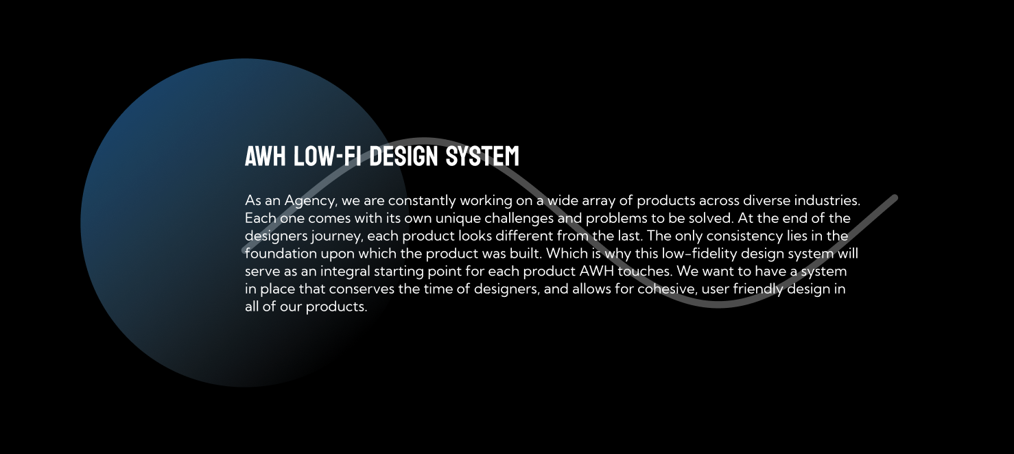
To begin building our lofi system we needed to create a strong foundation upon which it would stand. Which is why the first page in our Figma file is dedicated to the “why” behind its creation. This page is a helpful introduction to the system for anyone new that joins our product team.

What Are Your Principles?
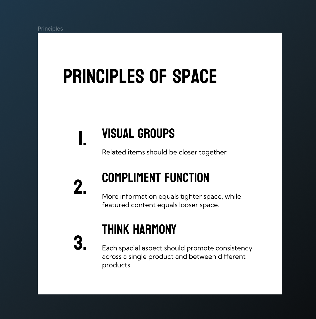
Within the concept of foundations, exists principles. For each foundational element, such as space, typography, and color, we came up with three design principles that we want to adhere to when building wireframes and eventually high fidelity designs for our clients. There are endless spacial principles to choose, but these are the ones we decided to focus on as a company.

Build Your Components
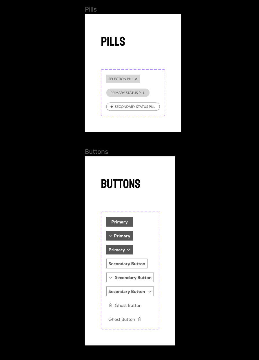
The last aspect we focused on when building our system was components. The puzzle pieces that will make up all of our designs going forward. To determine which components to build first, we audited our current products to see which are used most often. Obviously though, we did not capture all the components we could ever use in the initial creation of the system. The design system is a living document, always subject to updates and changes.

We hope to see many iterations of our low fidelity design system going forward. Who knows whether or not we will feel differently about the principles we selected, or components we designed. We hope to see lots of growth and change as we move forward and begin working with new clients. Stay tuned to see how we shift and move with the times and trends of good user experience and interface design.
